
Filtering & sorting
Preferred filtering and sorting in product-list pages.
A research-led redesign of how people find, compare, buy, organize, read, and listen to digital content.
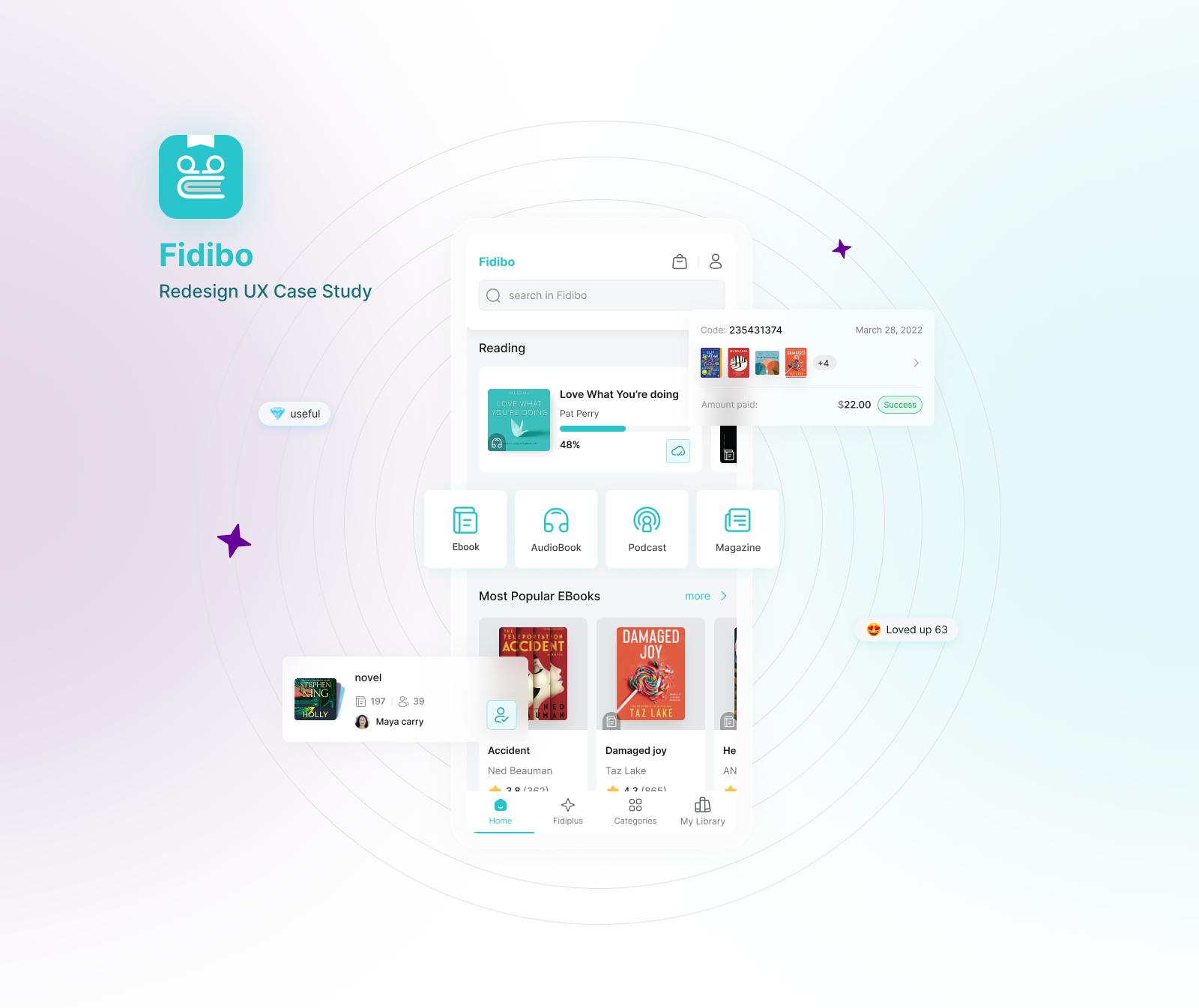
Fidibo combines e-books, audiobooks, podcasts, one-off purchases, and subscriptions. Finding the right title, comparing editions, managing a growing library, and getting comfortable with reading controls create different challenges for different users.
Research surfaced friction across discovery, library organization, Reader settings, and subscription expectations.
DESIGN QUESTIONHow might we make those connected journeys clearer without introducing additional complexity?
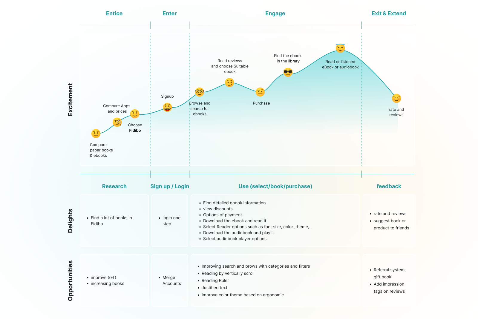
Our team combined qualitative interviews, a survey reported as having 218 responses, competitive benchmarking, and observed usability sessions to identify problems worth addressing.
Not every finding was a metric, and not every request became a feature.
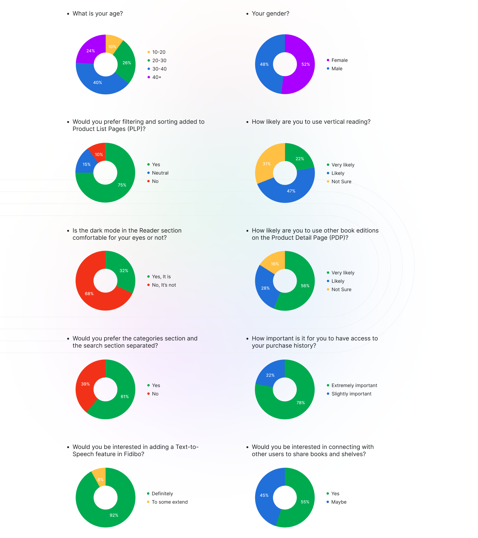
Preferred filtering and sorting in product-list pages.
Rated access to purchase history as extremely important.
Found the existing Reader dark mode uncomfortable for their eyes.
Historical survey answers reported in the original case study—not post-redesign performance. Per-question sample sizes are not separately confirmed in the provided images.
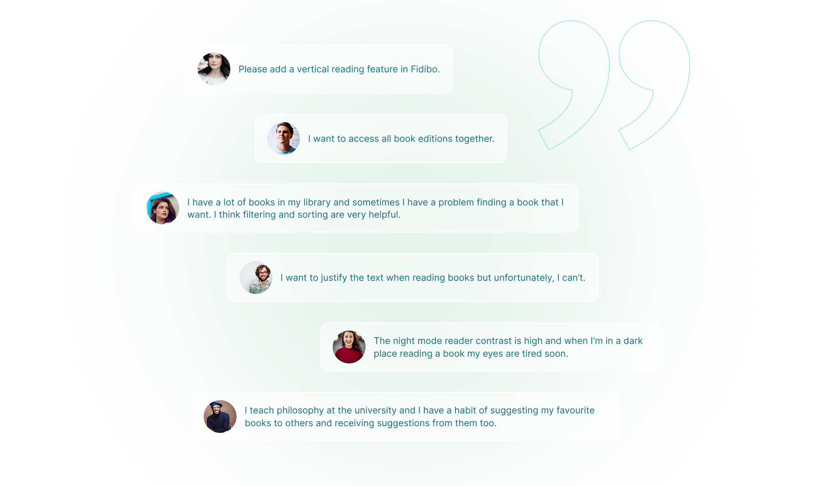
Evidence Users described difficulty finding books, navigating categories, and comparing different editions.
Design direction Clarify discovery patterns, increase the visibility of relevant book information, and explore more useful filtering and list structures.
Evidence Book organization and shelf concepts caused confusion; some users struggled to locate Reader settings or wanted more flexible reading modes.
Design direction Revisit library information architecture, make actions clearer, and improve the accessibility of reading controls.
Evidence Separate research into FidiPlus found that some users expected access to the entire catalog, while the subscription included only selected titles.
Product recommendation Make eligibility and access restrictions clearer before purchase and help users assess which titles are included.
Documented research recommendation; this study does not claim it shipped unchanged.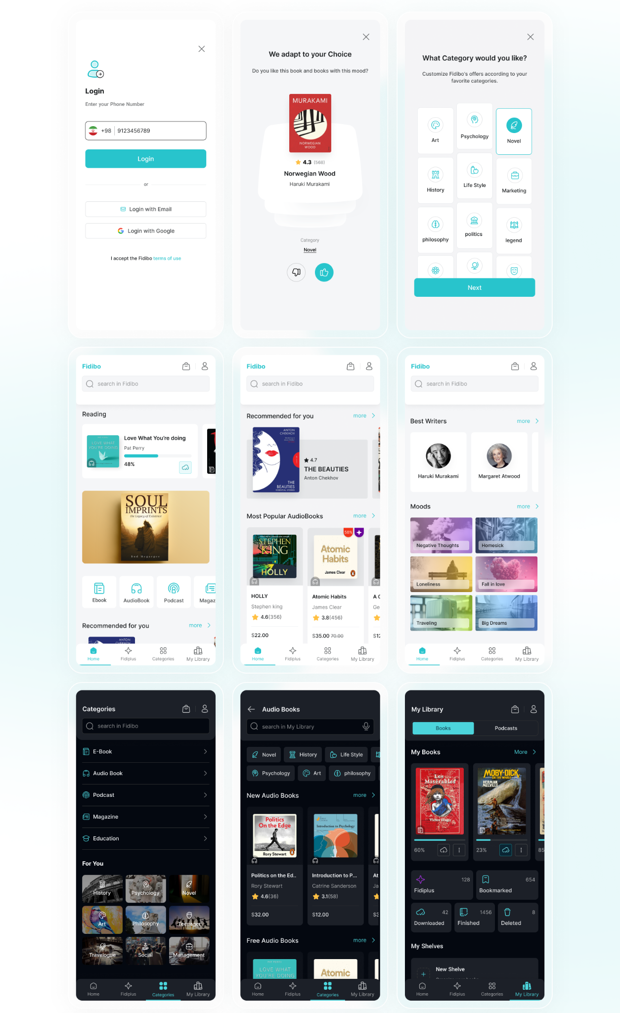
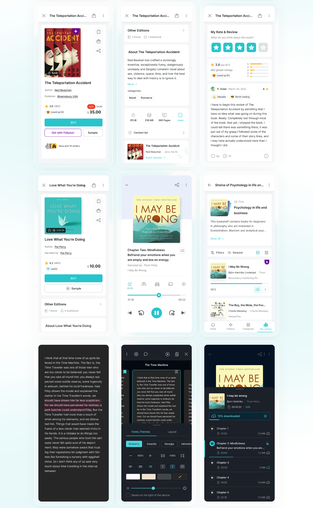
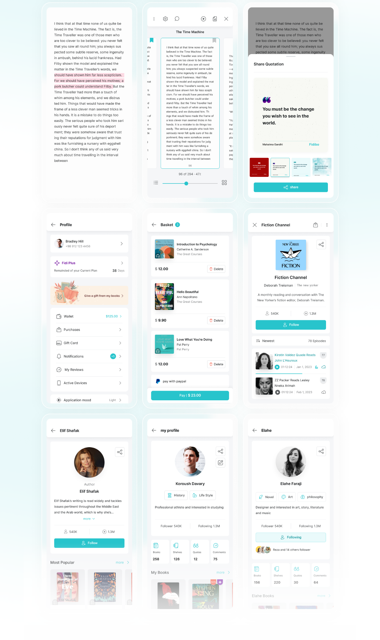
The montages document design work. They do not imply that every concept shown launched unchanged.
Our team built reusable design-system foundations, including typography, color, components, and interaction patterns, to support consistency and collaboration between design and engineering.
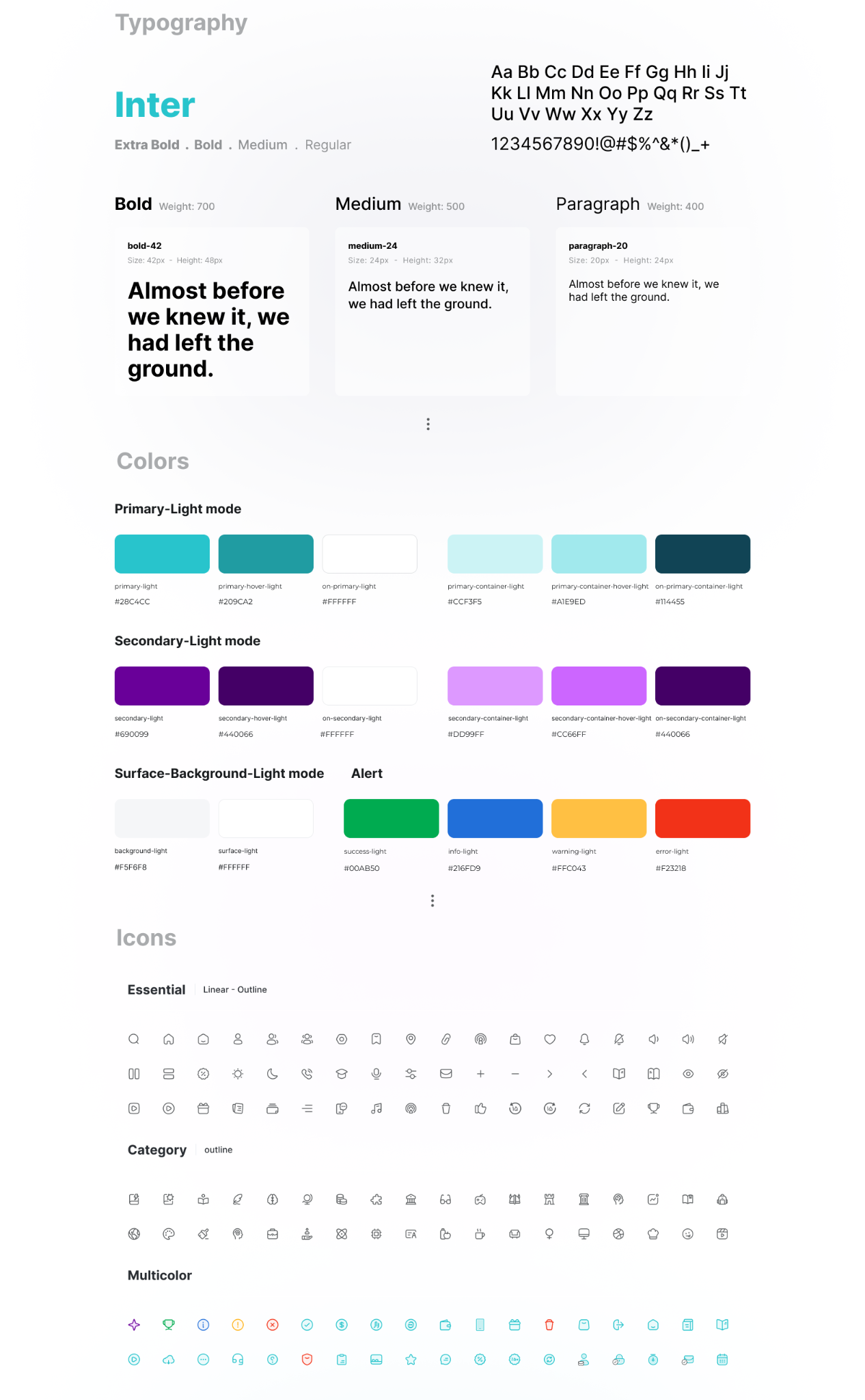
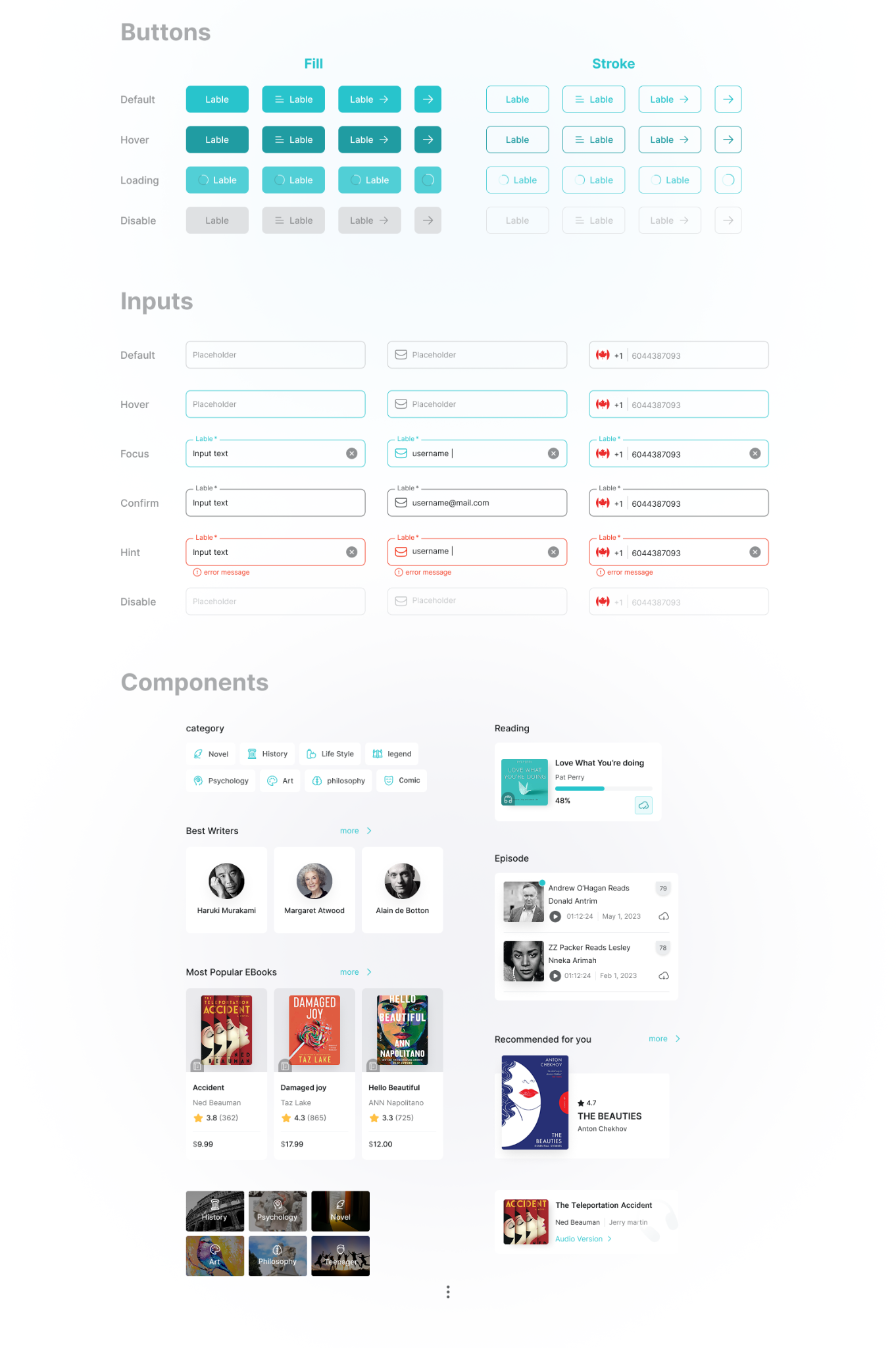
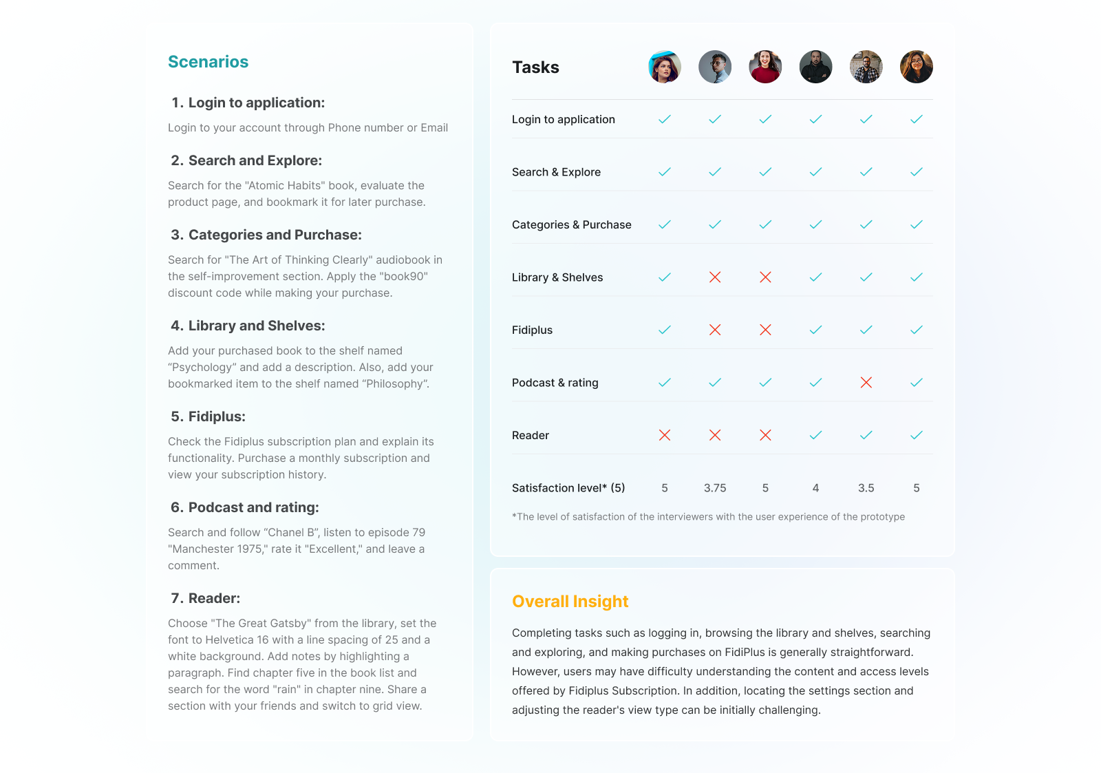
We tested the prototype with six recently active users, observing completion of realistic tasks and identifying places where the experience still needed clarification.
Reader controls, library organization, and subscription understanding remained useful targets for the next round of improvement.
| Prototype scenario | Successful task completions |
|---|---|
| Login | 6/6 |
| Search & Explore | 6/6 |
| Categories & Purchase | 6/6 |
| Podcast & Rating | 5/6 |
| Library & Shelves | 4/6 |
| FidiPlus | 4/6 |
| Reader | 3/6 |
Small-sample prototype usability study—not an A/B test or verified post-release conversion data.
The documented outputs include redesigned core journeys, evaluated prototypes, and reusable design-system foundations. The work provided specific user evidence to guide subsequent design decisions.
My takeaway: Leading product design means connecting user problems to defensible design choices, then staying open to evidence that a solution still needs work.
An earlier 20% conversion improvement figure was a pre-release estimate. It is not reported here as a measured post-launch result.
Book covers, titles, and prices in the original case-study screens were illustrative. Images show an earlier brand identity and are preserved as authored.